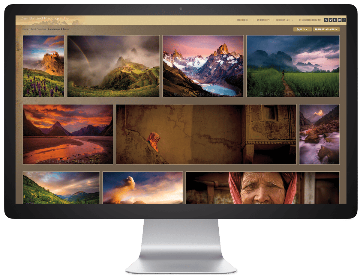
Five Design Tips for Building Your First Photography Website
October 23rd, 2020
You know why you’re here. You love photography and have been doing it all your life, any chance you get. School projects, adventures around town and out of state. Your friends are your biggest models, and so are strangers on the street. Or, maybe, you just started photography, and wonder why you haven’t been doing it all your life.
Now, you have so many photos you want to share with the world but not just on Instagram. You want to be seen and booked for the work you love creating. You want to sell your work online. But you’ve never made a website before. Where to begin?
That’s where you meet Zenfolio. Hello beautiful website (and easy to build).
Visitors will typically spend less than a minute making a first look on your site. Here are 5 design do’s and don’ts while building your first photography site.
1. Be selective. Don’t use too many colors.
Color is a huge part of our everyday lives. It’s emotional. It’s cultural. It can make a statement. It’s the stuff of life. It can be extravagant, layered and beautiful – especially in your photography!
But when it comes choosing color in your website design, most of the time: less is more. Too many colors can be disorienting, look unprofessional, and distract your viewer from the most important part…your online photo gallery.
The best rule of thumb when choosing colors for your web design is to stick to a limited number of consistent colors throughout – a triad color scheme (sticking to 3 colors) often works well.

2. Be you, but avoid the wrong colors in your website design.
Do you have brand colors? If your overall brand has a certain style or color theme throughout, using the color picker to create your own personalized color palette based on your portfolio is a great way to compliment your photography.
If you are just starting to create your brand and color palette, Zenfolio offers some easy to use templates with pre-set colors to get started. You can also preview before you publish. We also have a solid support team if you need help.
If custom is your thing, check out this color picker! https://image-color.com/ Be sure to use colors that compliment each other. A color picker is a great tool to use to develop a complimentary color palette for your website.
However, if you want to start a photography business, your personal brand is definitely something to start brainstorming. To get started – use a mood board to start creating your brand’s color palette. There are a lot of great (free) mood board resources online as well. Websites like Pinterest are a great place to start getting inspired. What colors and combinations catch your eye?

3. Avoid busy, crowded design
Just as using too many colors on your website is a no-no, we’re talking about crowded home pages, too many walls of text, overformatting, and outdated conflicting typography fonts. Stay clear!
Have an easy to read font, and generally stick with one font type for your site. It’s okay to have a similar second or third font type for things such as headers, but again you want to make sure these fonts compliment each other. Also, choose a font that matches your brand, and matches the type of audience you want to attract.
Speaking of too much text, and one thing to consider is site SEO (Search Engine Optimization). Generally, keywords are a great way to optimize your SEO and get you found online, but if you stuff your keywords with too many unrelated terms, this can actually hinder your chances of getting seen. Read more about SEO and how to best use keywords here: https://zenfolio.com/blog/50-shades-of-seo-keywords-are-your-best-friend

4. Don’t clutter your homepage
Build a site that is authentic, unique, and stands out just like you. That said, there are key design elements that are crucial for any website for visitors to successfully view it.
Typically, you want a client to be able to figure things out immediately, and get where they want to go in no more than 3 steps.
- Have a clean straightforward layout to the home page.
- Have a very clear way to contact you right on the home page.
- Have your key galleries for clients on your home page.
Your home page should be a clear calling card to prospective clients who are looking to book you for their photography needs.

5. Don’t include every picture you’ve ever taken on the homepage
A homepage is a great place to highlight your finest work with your portfolio galleries. Highlight your favorite session types with portfolio galleries that highlight a select few images. This will show off your best curated work which will engage prospects to click through for more. Also, set reminders once a month to consistently rotate your portfolio photos with new work to keep it fresh.
Take note, this page is specifically for new prospects. For client work, your galleries for gigs have templates to help present them in your brand. The home page is geared towards helping you with prospects. When visitors first click on your website and are taken to your homepage gallery, you want to show them the cream of the crop, la crème de la crème, and why they want you as their photographer for their next gig.
Final Thoughts:
Remember: Less is more. Consistency is key. Keep it simple, keep it neat, but that doesn’t mean it can not also be elegant, unique or artistic. Let your photos speak for themselves and draw your clients in.


