Design a Successful Photography Website with These Tips
June 30th, 2016
Designing your photography website can sometimes be a daunting task, but we are here to help. Website design expert and Zenfolio partner Shari Warren provides site design and training service through her company Warren Creative Design. We asked her for some insider tricks on how to create a stunning website or portfolio.
Getting Started
“The first task when designing a website is to determine the structure and organization of the web pages needed. This process can be done in many ways, such as a bulleted list with categories and subcategories, a rough pencil sketch on paper, or a diagram drawn in a graphics program with boxes and lines to represent the pages (referred to as a site map),” Shari said.


“A portrait or wedding photographer’s website will typically consist of the homepage, portfolio galleries, client galleries, about page, and contact page. It may also include additional pages such as testimonials, blog, investment and session prices, FAQs and what to wear.”
“A fine art photographer’s website will have a homepage, portfolio galleries, about page, and contact page. It could also have pages for awards and achievements, show/exhibit schedule, classes and workshops.”
Determining Your Site’s Look and Feel
Another great tool to help you get started building your Zenfolio site is our Getting Started Guide. Some photographers can hit a roadblock when trying to accurately reflect their brand through the design. Here are Shari’s suggestions to achieve this.
“Any photos that are not their personal best should be edited out and left off the website. Then the task is to determine the right colors, fonts and layouts that truly best showcase their work. Once the site design is established, it is important to use the same design, colors and fonts for their other promotional materials so they are consistent in their brand identity.”
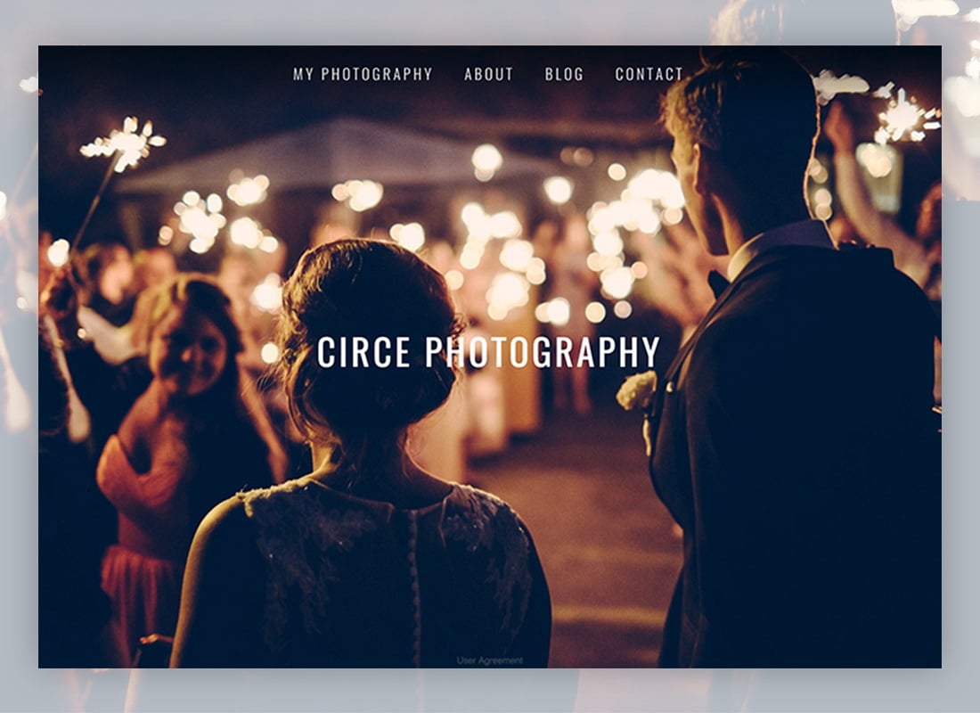
There are several easy ways to edit the look of your Zenfolio site—presets, themes, layouts and page options. We recommend trying our presets if you’re looking for a quick way to apply a template. Once you have one in place you can customize it. Check out our help guide for more information on using presets. See below for two preset examples.


Selecting Images for the Homepage
Once you have decided how you want your site to be represented, the next step is is choosing the images to feature on your homepage. Here’s what Shari recommends.
“For portrait or wedding photographers, the homepage photos should represent a selection of their best work from each of their portfolio galleries. And for fine art photographers, the photos would also represent the specialties they shoot, which should include some of their best sellers to date. I recommend no more than 10-15 photos for the homepage. Visitors’ attention spans are extremely limited when web browsing (think of your own time spent when viewing websites), so you have to show your most stunning images in the first 3-5 photos on the homepage. This exercise forces the photographer to only select images they feel best represents their unique style.”
Choosing a Site Design
It’s important for photographers to stay up-to-date with design trends. Even if your photos are current, if the design looks old your visitors will wonder if the body of work on the site is old too. Below, Shari covers the popular current website design trends.
“Most of the photographers I have been working with are looking for a clean, modern, elegant website with either a light- or medium-toned neutral color theme. The full screen or photo strip layout is a popular trend for the homepage, and grid layouts, similar to the Instagram or Pinterest layouts, are popular for the galleries. That being said, there are opportunities to strategically add some graphics or textures in the header, footer and even backgrounds to further complement the photographer’s style.”
Making your site user-friendly is a great way to make a first impression and conveys a sense of professionalism. Shari has five tips on how to design your photography website this way:
Easy Navigation
“Make sure your menu items are clear and that only important info is included. Too many menu items can confuse your visitors. If you have many galleries or custom pages, consider using drop down menus where appropriate.”
Simplify Your Pages
“Only show photos and text that are important. Too much visual clutter looks unprofessional and disrupts the viewing experience.”
Large, Readable Fonts
“Make sure your fonts are at least 13 pixels or larger so the text can be easily read by viewers of all ages. You should also view your website on a mobile phone to be sure your text is large enough to read. Limit your choice of fonts to three or less, and be consistent using those fonts on all pages, including custom pages. Use decorative fonts sparingly, and only use them as an accent or main headers.”
Curate Your Photo Galleries
“It is more impressive to show 20 to 25 of your best images than 80 photos of varying quality. Visitors don’t have a large attention span and will not keep scrolling to view all your work. If you do need to show a lot of images, consider creating sub-galleries for a more streamlined viewing experience.”
Backgrounds and Colors
“Limit your color scheme to neutrals, or if you want to use non-neutral colors, be sure the colors don’t clash with the colors shown in most of your photography. Using a graphic or textures, such as in a header, can add to the personality of your website. But again, be sure they work with your genre of photography and do not appear more important than your photography, which should be the focus of your website.”
If you’d like to edit the color scheme and font in your theme, we recommend editing your theme in Theme Designer. You can learn more about Theme Designer here.

Design Mistakes to Avoid
Now that we have covered best practices and elements of good design, let’s discuss what photography website design mistakes to avoid. We asked Shari to share the common design mistakes she sees.
“Design Mistake #1. Using a dark or all-black color scheme on a portrait or wedding website. When you shoot portraits or weddings, you are capturing a joyous occasion and memories full of light, colors and emotion. Those dark colors overshadow those sensitive moments and don’t let your photography shine. Dark colors work well for more dramatic and moody fine art, architectural, industrial or sport event photography.
Design Mistake #2. Script or italic fonts for paragraphs of text. While these font choices can be fine for occasional headers or testimonials, they are generally difficult to read, especially on mobile phones.
Design Mistake #3. An ugly logo. Having a clean, professionally designed logo is necessary if you want people to trust that your work is professional. If you don’t have the graphic skills to design a nice logo for yourself, ask some of your colleagues to recommend a graphic designer that they trust. You can also find a designer online. Remember that your logo is an investment in your brand that you will use for all promotional materials and social media for years to come as you grow your business.”
So what qualities does Shari think make a photography website great?
“A great website has beautiful and compelling photography that is showcased, organized and invites the viewer to see more and provides a call to action to contact the photographer for services or to purchase their photos.”

Shari Warren of Warren Creative Design has provided design, training and business consultations to hundreds of Zenfolio photographers since 2011. With her background as an art director in the software and publishing industries, she brings a creative, objective eye and marketing savvy to help portrait, wedding and fine art photographers showcase their photography and set up their websites and shopping carts to help accomplish their business goals.

Taylor McGregor, a native of Silicon Valley, is a customer service representative at Zenfolio. She has a BFA in photography and graphic design. Her passions are photography, the great outdoors, and racking up frequent flier miles.