Creating the Wow Factor: The Principles of Photo Compositing
November 16th, 2015
Everyone wants to push the envelope with his or her images. Photoshop has enabled us to create fantastic images way beyond what the camera can capture by adding enhancing elements and layers. But few are able to attain the amazing results Photoshop masters can. Some of it has to do with mastering a difficult application like Photoshop and some has to do with common sense. The president of LayerCake-StudioMagic, creators of compositing software, shares his insights on the three basic principles that every compositing artist should know when pursuing the elusive wow factor.
1. Pay Attention to Lighting Position
Taking a moment to note where the light source is will help you make an informed decision when picking images/elements to fit your new composite. Below is a scene illustrating my point. If the bird watcher in the photo were lit from the left or from above, we would think, “something weird is going on” and we wouldn’t believe the illusion for a second. We note the uniform effect the light has on both the background and the subject and, voilà, see perfect harmony and integration.
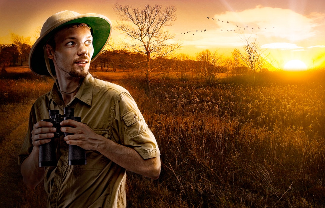
If the subject were lit, even slightly, from the wrong angle, our eye would detect it instantly. This may not be a conscious awareness but we would know that something isn’t quite right.
The model in the photo, which was cut out using our CutOut tool, was originally lit quite flatly and straight on, but I liked him so much that I relit him in post production, and used the LightBrush tool in StudioMagic-I to focus the light a bit. This is not something I’d recommend delving into because it takes a lot of hard work and observational skills that most of us don’t have the time or desire to execute. However, in a pinch, I did it and it worked. It’s better to know what you need beforehand and either get it right in camera or shop for the right stock images.
Here’s a more subtle and realistic example of matching up direction of light. There is nearly perfect integration between the inserted model and the background. The athlete is standing close to the windows at camera right. That means I need the model lit from the right. See how nicely he blends in? Granted, I put an edge light on him and a strong light shaft from right window, which helps the overall look. These are all things that can be done in Photoshop, but I cheated and used the StudioMagic II compositing panel, which is easier and faster with all those features already built in.
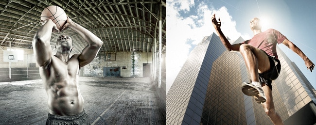
Let’s jump to quality of light. Generally, standing near a big light source like windows produces a soft light. By soft, I mean that there are no harsh edges to the light, and it falls off or fades gradually as it wraps around an object. Using a model that was lit in hard noon daylight wouldn’t work, and would make you think there was a hole in the roof or the wall and the sun was hitting him through that hole.
So scroll back up and let’s take a second look at our bird watcher friend. Notice the quick fall off of light—it’s a very fast transition. He goes from being very bright on the right side to suddenly very dark on the left side. That’s because the sun is a small source of light in relation to the subject. The rule here is the bigger the source of light in relation to your subject, the softer the light.
So in the case of the athlete and the lady below, a big, close light source equals softer light. In the case of the bird watcher, a small, distant light source equals a strong, hard light to dark transition. So think about the direction and quality of light when you’re setting up your studio lighting to match your composite background. These two qualities will go a long way toward helping you create believable composites that please the eye.
2. It’s All About Perspective
Perspective refers to the angle and height of the viewer/camera as it looks toward the subject. All the different elements/photos in our composite must share the same angle/perspective to be believable.
Ever notice how when looking up at skyscrapers the bottom appears wide and the top appears narrow? We don’t even need to know why this occurs. We just need to note it and recreate it when photographing our subjects. How extreme should the effect be? Experimentation is the key.
Try layering in the model into the background and testing whether it looks natural. Once it’s right, you’ll know it. What happens if you don’t observe and respect this principle when shooting and creating your works of art? The building is odd looking and doesn’t match the perspective, making the photo appear fake.
Here’s a quick composite using a couple of stock images, the StudioMagic CutOut tool, and the LightingEffex from the StudioMagic II compositing panel. Notice how we can see the underside of the chin, shoes, nose, etc. This is consistent with looking up at the building. He’s bigger at the bottom and smaller at the top, just like the building is.
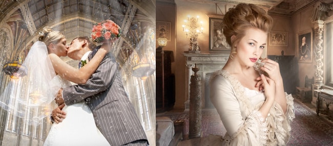
Another aspect of perspective is the camera’s height from the ground. We could shoot the model at eye level or down by the floor. To decide this, look at the background scene for clues. If your background image is a church like the one below and you can see the roof, you should be low when you shoot the bride and groom in order to match the background.
3. Size & Scale Matter
Size and scale are always the most obvious things overlooked. They can make a lizard look like Godzilla, an adult look like a child, or a grizzly bear look like a teddy bear. Unless that is the intent, here are a few tips to consider.
First, observe things in your image that are a known size. Everyone knows the normal size of a hammer, a surfboard, pencil or a suitcase. Use things you are familiar with as your point of reference to determine comparison or scale. This has to do with observing things next to each other (as opposed to in front of or behind).
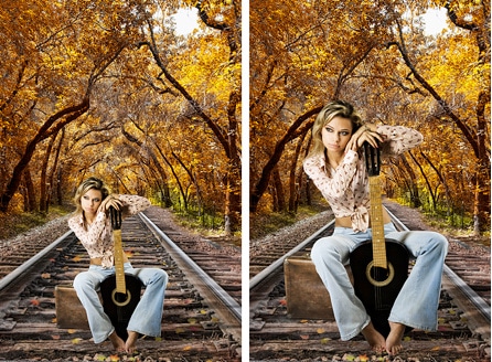
Since shooting on railroad tracks isn’t recommended, we created virtual sets like this one, that you can “drag” people into. The artist used StudioMagic’s CutOut to remove this country singer from her original background and did a good job matching the direction of light using the ShadowCaster tool. But, holy smokes, is that a leprechaun on the left? Size and scale will tip off a bad composite every time. You know how big your foot is, right? Look down at it now. A railroad track rail is 6-8 inches high and a railroad tie is 10-12 inches wide. Now look at your foot. This is not rocket science, folks.
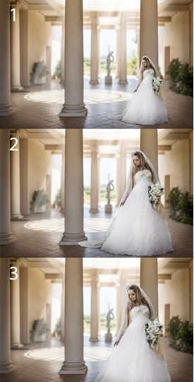
Let’s try another scenario: the bride in a beautiful portico. Again, we used quick and easy CutOut and ShadowCaster tools. The light shaft was created with LightingEffex in StudioMagic II. In example number one, there are a number of visual clues. The statue in the distance is about 10’ high, the pillars are around 3’ wide, but the best clue is the Spanish tiles, which we know are 12” by 12”. For relative size, I have the bride’s waist size, head and bouquet to compare to the pillar and the tile. I compare to what I imagine her shoe size to be. If you calculate the relative size of all the objects near the bride you can get a pretty good idea of the brides size in the image.
Example number two is when the artist throws out all that information and simply puts the bride in and makes a blind guess. Example number three is a great trick when you’re stuck or the subject just doesn’t seem to fit—just move her forward in the image and crop off her feet. There’s an illusion created that she’s closer to the camera, and it makes it much easier to make relative size and perspective look more believable.
If this sounds complex and a bit like brain surgery, the best way to practice is to simply be aware of what’s around you. The answers are everywhere in photos and in real life. Observation is the key to artistic knowledge and intuition. When I can’t come up with the answer, I go research it. I look around to identify, compare and observe what distance and camera optics do to different objects. When all that fails, I simply look at the size of my foot.
* * *


